The Evolution of The Jasmine Pearl's Branding
Jun 15th 2015
Note: The below article was written back in November of 2014, but has recently been updated with new images. Check it out! Have you noticed that we have a new look at The Jasmine Pearl? We partnered with Portland-based Relevant Studios to give our entire brand an uplift.
A redesign of our packaging and logo was definitely due. We loved our existing packaging, a result of years of tweaking and refining, but the years of tweaking had given us a brand that was pretty disjointed. So with the vision and guidance of Andy Kerr and Mauria Betts we embarked on the journey of creating one cohesive feel for the Jasmine Pearl's branding.
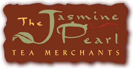
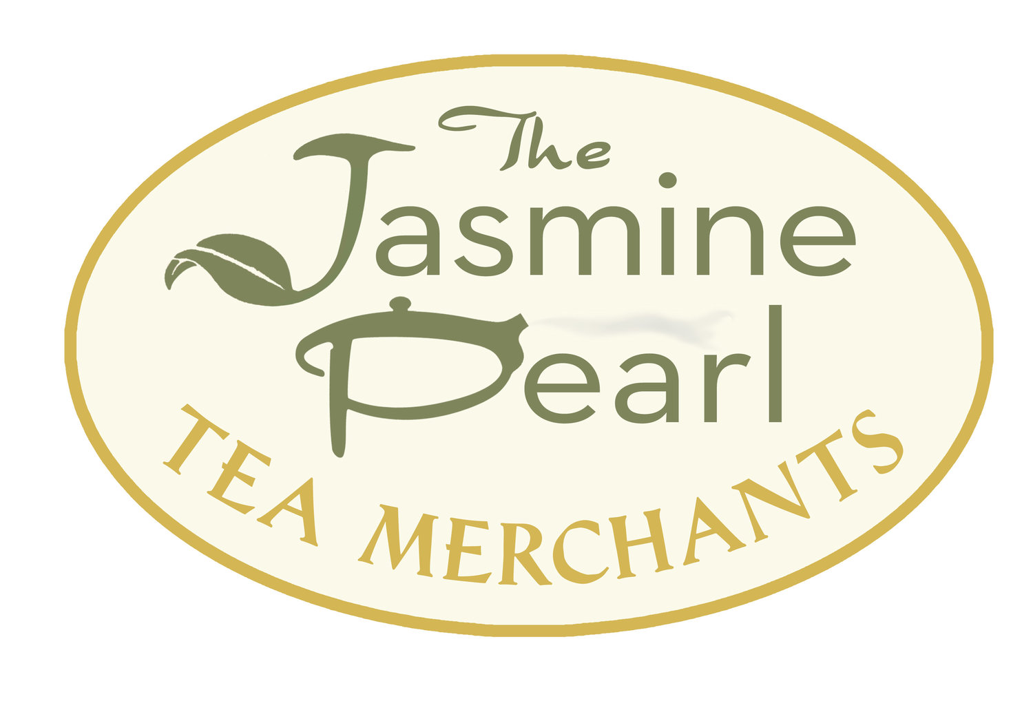
This first step was to reevaluate our name. We had always called ourselves The Jasmine Pearl Tea Merchants. Chuck and I loved the quaintness of the term "merchants" and because that term was was not used widely. When we looked at our brand, ten years after we came up with the name, we realized that we were so much more than tea merchants. We were tea importers, blenders, educators and wholesalers. We wanted to reflect the global feel of our company - after all tea has always been a global beverage. So we started by changing the name on our logo to The Jasmine Pearl Tea Company.
TEN YEARS & FOUR LOGOS LATER (YES SERIOUSLY)
JP LOGO 2004
DESIGNED BY TIFFANY HOWARD
Our original logo was funky and worldly.
JP Logo 2006
REFINED BY JP DESIGN TEAM
We re-imagined and refined the logo to make it more readable.
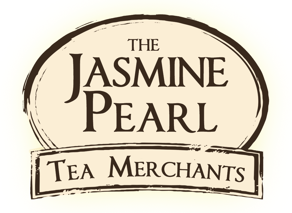
JP LOGO 2010
JP IN-HOUSE DESIGN TEAM
A total redesign of the logo. We were wanting a logo that looked like a stamp on a passport or a postcar
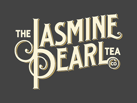
JP Logo 2014DESIGNED BY RELEVANT STUDIOS
This logo was part of a complete brand overhaul.
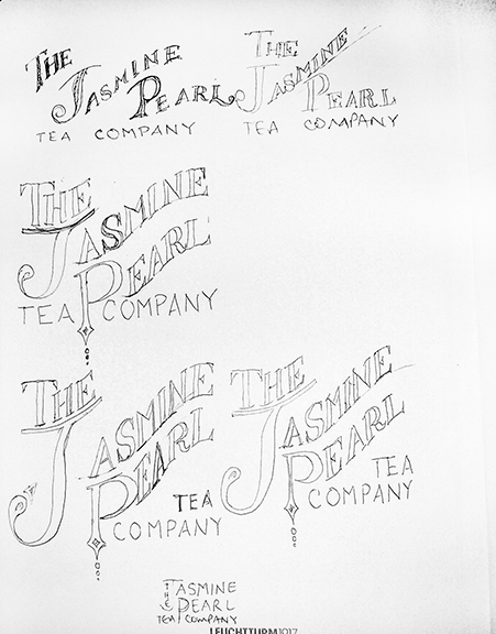
Chuck's logo sketches
A funny side note about the development of our new logo: Early on, Chuck sketched an idea he had in his mind. He knew what feel that he was looking for. Here is the sketch:
Chuck kept his sketches to himself, letting Relevant work their magic. A few weeks later, Andy and Mauria at Relevant presented several logo concepts, including what turned out to be our future logo (above). The similarities between the designs were uncanny (especially the logo in the upper left corner of his sketch)! Does Relevant use psychics? To this day, I do not know, but obviously they really "got" what we were going for.
FANCY SCHMANCY PACKAGING
JP Packaging 2004
DESIGNED BY TIFFANY HOWARD
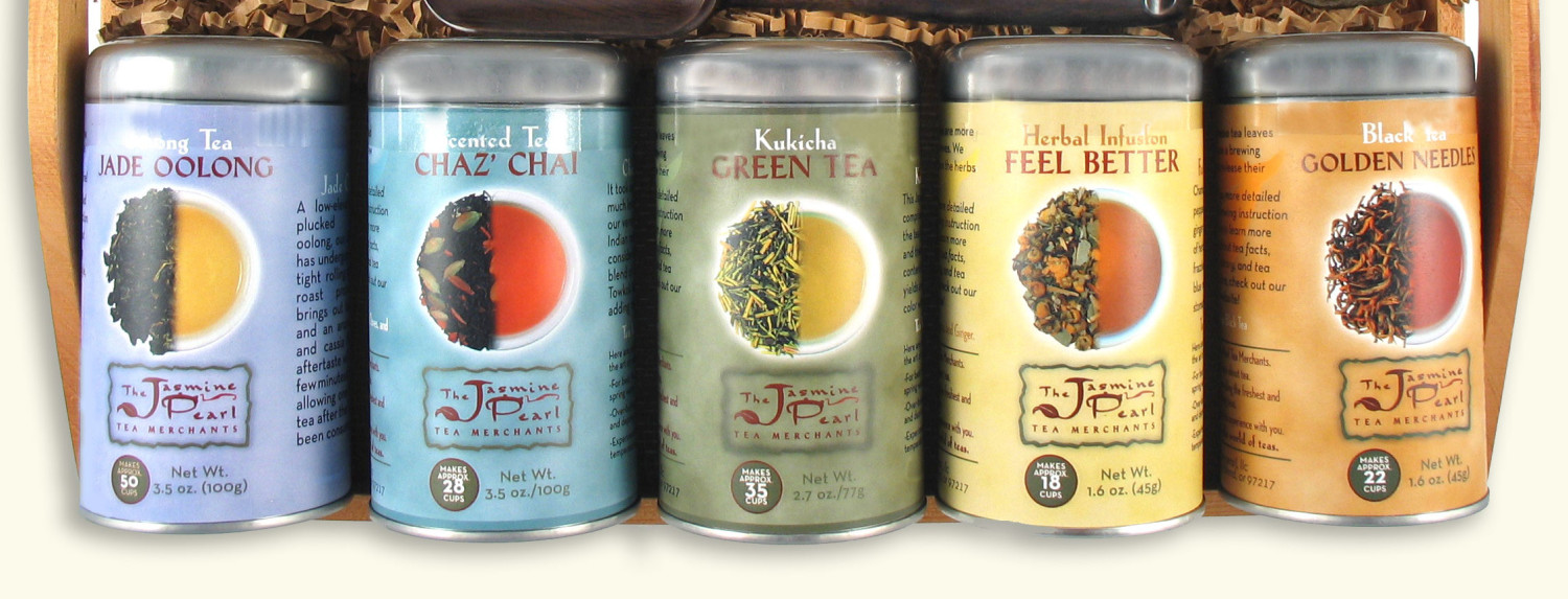
A colorful packaging design featuring a photo of both the tea leaf and brew .
JP Packaging 2010
DESIGNED BY JP IN-HOUSE DESIGN TEAM
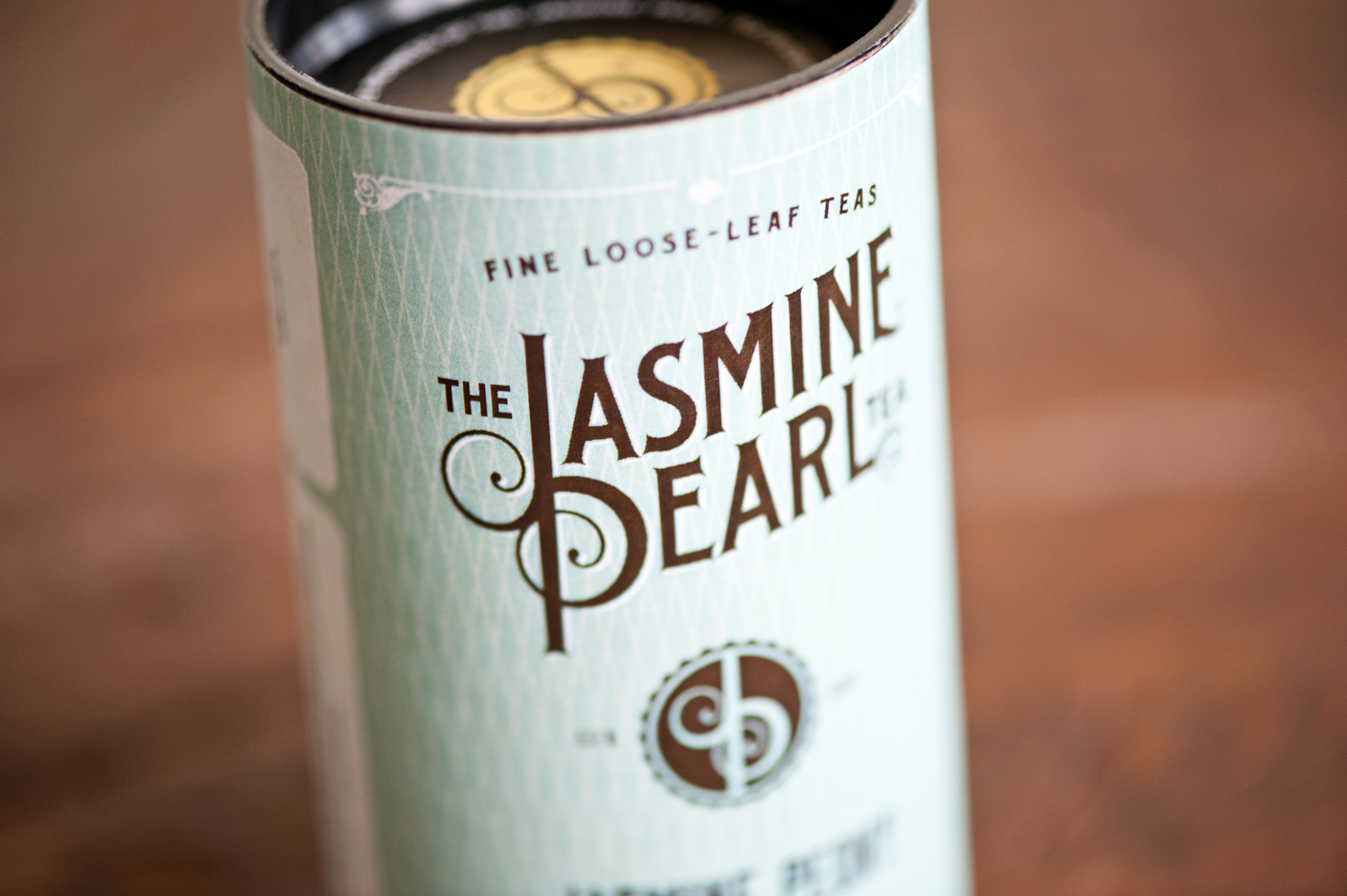
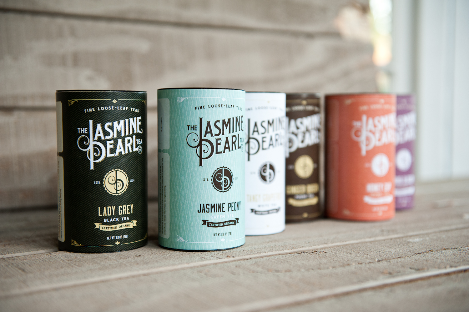
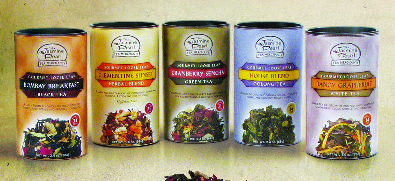
A redesign that incorporated color and imagesJP Packaging 2014
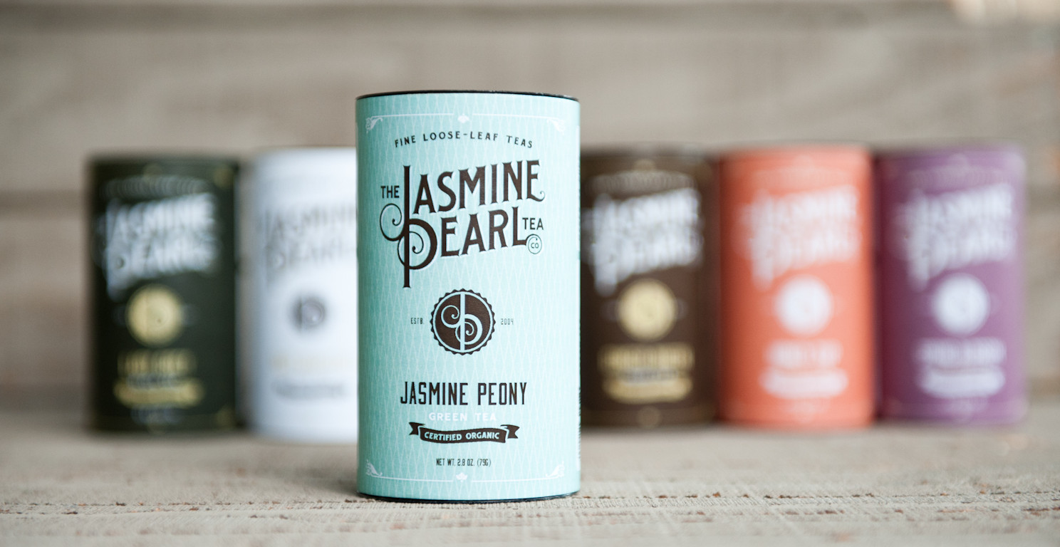
DESIGNED BY RELEVANT STUDIOS
A completely refreshed contemporary look with vintage vibe.
The next step was packaging. We had innovated a new type of tea packaging for loose leaf teas a few years prior, by utilizing home-compostable cello and 100% recycled paper instead of the traditional tea tin. Although our new vessel felt more earthy and kraft, the tea inside was still made of top-tier, fresh, exceptional ingredients. We wanted our label to convey this. Relevant Studios updated our color palette to a more contemporary scheme. Then they incorporated something that Chuck really liked, a classic turn of the century vibe. Now it seems like everyone is going for the old-timey look these days, but this was an aesthetic that Chuck has always really liked. We wanted a classic feel, something that reflected tea's old-world roots.

Picking a design and refining was fun, but surprisingly challenging. The challenge came when we tried to make decisions democratically, involving everyone on staff. The thing I learned is that if you ask five people for their feedback, there is a good chance you will get five completely different opinions. so getting a consensus turned out to be difficult.